Drinking-Water Quality Explorer from Open Government Data
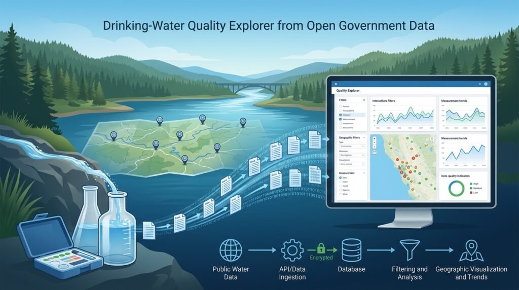
A beginner-friendly data project that turns the EPA/USGS Water Quality Portal — a huge public collection of water-quality measurements from across the United States — into a local, explorable application. You query the portal’s web services for a county, watershed, or monitoring site of interest, clean and organize what comes back, store it in a small database, and build charts and summaries that answer real questions: which contaminants have been measured near a location, when, at which sites, and how the observed values compare with reference context values you choose to display alongside them. The finished project is an exploration tool: it makes open government data approachable, and it is equally honest about the gaps — missing samples, detection limits, and sparse coverage — that every real environmental dataset carries.
>An educational explorer, not a water-safety verdict. This project summarizes publicly reported measurements for study and awareness. It cannot tell anyone whether water is safe to drink: measurements are sparse in space and time, portals may lag behind current conditions, and interpreting results against health limits requires expertise and properly collected samples. For real drinking-water decisions, people should rely on their water supplier’s consumer-confidence reports, certified laboratory testing, and their local health authority. Your app should say so — prominently.
Who Is This For?
- Environmental-science students who want a gentle first project with real, messy government data instead of a toy CSV
- Civic-tech builders and community volunteers who want to make public water records easier for non-specialists to explore
- Developers early in their data journey practicing the full loop: API ingestion → cleaning → database → visualization
- Educators looking for a one-semester project that teaches data quality, provenance, and honest communication
The Problem
Water-quality data in the United States is public by design — the Water Quality Portal aggregates submissions from the EPA’s Water Quality Exchange and the USGS National Water Information System, with contributions from hundreds of state, federal, tribal, and local agencies. But “public” does not mean “accessible.” The raw services return wide tables full of codes, units, detection qualifiers, and nulls; a curious resident who simply wants to know what has been measured in their watershed faces a wall of jargon. Meanwhile, most tutorials teach data cleaning on pristine sample datasets, which teaches the wrong lesson. This project sits exactly in that gap: it teaches the real skills on real data, and its central design constraint — explore, never declare — forces beginners to think about what data can and cannot support.
How It Works
The pipeline is deliberately simple enough for a first project, but every stage teaches a durable skill. Build the stages in order; each one’s output feeds the next.
1. Query the Water Quality Portal
The portal exposes documented web services that accept query parameters — site identifiers, county or watershed codes, characteristic (contaminant) names, and date ranges — and return results as structured tables (CSV among the formats). Start small: one county, one or two well-known characteristics such as nitrate or lead, one year of data. Study the returned columns before writing any cleaning code. The portal publishes user guides and a web-services document; read them first so your queries reflect how the data is actually organized, rather than guessing at parameter names.
2. Clean and Normalize
Real results arrive with quirks you must handle explicitly: different units for the same characteristic, results reported as below detection limits, duplicate submissions, and missing metadata. Build a cleaning stage that standardizes units per characteristic, encodes “non-detect” values honestly (keep the detection limit rather than inventing a zero), and records every transformation. This stage is the heart of the project — and a genuine skill multiplier for everything you build afterward.
3. Store It in a Local Database
Load the cleaned rows into a small relational database (SQLite is perfect) with a simple schema: sites, results, and a reference table for the characteristics you support. A database, rather than scattered CSV files, gives you filtering, joining, and reproducible re-ingestion — and it keeps the app responsive even when a query returns tens of thousands of rows.
4. Compare with Reference Context Values
For each characteristic you support, let the app display reference context — for example, a regulatory threshold or health-related benchmark that the user or maintainer has chosen to show — as a clearly labeled band or line on charts. The values live in a table you curate, with a source note for each. The app never computes its own safety judgment; it shows measurements and context side by side, and it labels every context value with where it came from and what it applies to.
5. Visualize and Summarize
Build the exploratory views: measurements over time per site, value distributions per characteristic, site counts per watershed, and a coverage map or table showing where samples exist — and where they do not. Every chart should render the data’s texture honestly: non-detects shown distinctly, detection limits visible, sparse periods visibly sparse. A coverage summary (“this county has 41 nitrate samples since 2020, collected at 6 sites”) teaches more than any single number.
6. Surface Data-Quality Limitations
Give missingness a first-class UI. A “data coverage” panel lists characteristics with no recent samples, sites with stale records, and results reported under detection limits. This panel is the project’s integrity feature: it prevents the most common misuse of exploratory environmental tools, which is reading absence of data as absence of contamination.
7. Keep It Local and Reproducible
Everything runs on your machine: queries fetch data, a script refreshes the local database, and the app reads only local storage. Fixed query parameters and a recorded fetch date make any chart reproducible. Local-first also keeps the project gentle on the public service — cache responses, batch queries politely, and avoid re-fetching data you already have.
Key Features
- Location-first search — explore by county, watershed, or monitoring site
- Per-contaminant views — time series, distributions, and site comparisons for each supported characteristic
- Reference context bands — user-curated thresholds displayed as clearly labeled context, never as verdicts
- Data-coverage panel — missingness, non-detects, and stale records surfaced as first-class information
- Provenance on every screen — source, query parameters, and fetch date shown with the data
- Local-first and cache-friendly — polite querying, cached responses, reproducible refreshes
Functional Requirements
- Query WQP web services by location and characteristic with configurable date ranges
- Clean and normalize results: unit standardization, non-detect handling, deduplication
- Persist cleaned data in SQLite with sites/results/characteristics schemas
- Render time-series and distribution charts per characteristic and site
- Display curated reference context values with source labels
- Generate a data-coverage report: samples per site, per characteristic, per time bucket
- Export filtered results to CSV for further study
User Stories
- As a resident, I want to see which contaminants have been measured in my watershed and when, so I can understand what public monitoring covers.
- As a student, I want non-detect results shown distinctly so I learn that below-detection-limit data is still information.
- As an educator, I want the fetch date and query parameters displayed on every chart so classroom analyses are reproducible.
- As a civic volunteer, I want a coverage report for my county so I can show where monitoring is thin.
- As a developer, I want the reference context values in an editable table so I can adapt the tool to my region’s characteristics.
MVP Scope
A minimal but complete MVP:
One supported region (your county or watershed) and two or three characteristicsQuery → clean → SQLite ingestion as a single scripted refresh commandTime-series and distribution charts per characteristic, with non-detects rendered distinctlyOne curated reference context table with source notes, displayed as labeled bandsA data-coverage panel plus a persistent “this is an exploration tool, not a safety verdict” noticeExplicitly out of MVP: multi-state coverage, predictions or forecasts of any kind, map tiles at scale, automated threshold lookup from regulatory sources, and any export aimed at health decisions. All are natural extensions — none are MVP obligations.
Project Timeline
- Week 1: read the portal’s web-services guide; make first queries; study the returned structure
- Week 2: cleaning pipeline (units, non-detects, dedup); SQLite schema and ingestion
- Week 3: charts and reference-context display; coverage panel
- Week 4: app polish, provenance labels, notice text, CSV export, README with limitations
Testing Strategy
- Ingestion tests: unit conversion correctness on known rows; non-detect encoding preserved; duplicates collapsed with their provenance intact
- Data tests: re-running the refresh on cached responses produces byte-identical tables; schema constraints reject malformed results
- Visualization tests: charts render for empty result sets (with an explicit “no samples found” state rather than a blank plot)
- Guardrail test: the app’s notice text and context labels render on every view — the honesty layer is itself a requirement
Security and Privacy Considerations
- The data is public; treat the service with respect: cache responses, identify your queries politely, and avoid hammering the portal with broad repeated requests
- Curated reference context values must carry their source and scope; an unlabeled threshold is a hazard, not a feature
- If you extend the tool to accept user-contributed notes or locations, keep local storage encrypted at rest and avoid collecting identities — the tool needs no accounts
- Document that the underlying records come from many contributing agencies with varying collection methods; your explorer inherits their caveats
Success Metrics
- A scripted refresh command takes a fresh query to a populated local database without manual intervention
- Every displayed measurement is traceable to its site, date, and original submission (provenance intact)
- The coverage panel correctly lists characteristics and sites with sparse or stale data
- A first-time user can answer “what has been measured near me?” in under a minute of exploration
- The project’s README states the exploration-only boundary and points to official channels for real decisions
Common Challenges
- Portal complexity — dozens of query parameters and code lists; start narrow and read the guides before coding
- Unit chaos — the same characteristic arrives in different units across agencies; normalize per characteristic with tests
- Non-detect temptation — replacing below-limit results with zero or half-limits is a statistical decision; encode them honestly and document what you did
- Coverage illusion — a chart of one site’s samples can look authoritative while neighboring watersheds have none; keep the coverage view prominent
- Threshold misuse — reference bands invite misreading; label sources, scope, and as-of dates on every display
Learning Objectives
- Practice the complete beginner data pipeline: documented API ingestion → cleaning → relational storage → visualization
- Learn how environmental monitoring data is actually collected, submitted, and aggregated across agencies
- Treat data quality as a feature: missingness, detection limits, and staleness become visible UI, not hidden noise
- Communicate uncertainty honestly — the difference between showing measurements and judging safety
- Build respect for public data services: caching, politeness, and reproducibility
Why This Idea Is Different
The site’s environmental projects each transform data; this one organizes and contextualizes it. The Air Quality Prediction & Pollution Hotspot Mapper builds a forecasting model over air measurements — a prediction job with a model to train. The Smart Walking Route Planner (a product idea consuming environmental feeds to rank walking routes) is a consumer scoring job — a consumer scoring job. This project has no model and no ranking: it is pure open-data exploration — ingestion, cleaning, storage, and honest display of water-quality records, with the coverage gaps treated as a core feature. The Data Quality Scorecard for Data Teams shares the quality-awareness mindset but targets internal data pipelines; here the same discipline is applied to public scientific data and made legible to non-specialists.
| Tool type | Approach | Limitation |
|———–|———-|————|
| Portal web forms | Official query interfaces for the raw data | Power-user oriented; jargon-heavy; no local exploration layer |
| Agency dashboards | Pre-built views for specific programs | Fixed scope; rarely county-level or characteristic-flexible |
| Research notebooks | One-off analyses published as papers/code | Not reusable tools; rarely maintained for non-specialists |
| Generic mapping apps | Show monitoring sites on a map | Little measurement context; no data-quality surface |
This project’s differentiators: a beginner-buildable end-to-end pipeline on a verified public source, honest non-detect and coverage handling, curated reference context with provenance, and an explicit exploration-not-certification boundary baked into the UI.
Technology Stack
- Python — the whole pipeline
- requests / pandas — API querying and tabular cleaning
- SQLite — local relational storage (via Python’s built-in sqlite3)
- matplotlib or Plotly — charts and distributions
- Streamlit — the explorer UI
- pytest — ingestion and data tests
Future Enhancements
- Multi-county coverage with a watershed browse mode
- More characteristics with per-characteristic cleaning rules and context tables
- Change-view: compare a site’s recent decade against its own longer history (contextual, not predictive)
- Community notes layer (stored locally, no accounts) for annotating sites with publicly known context
- Scheduled polite refreshes with a fetch-history log for full reproducibility
Browse more Project Ideas · Beginner Ideas · Environment Ideas